
WE Communications Brand Refresh
As the Senior Graphic Designer for WE Communications, I created an evolution of the brand through vibrant duotones, bold designs, and purposeful creativity, bringing to life our commitment to driving change.
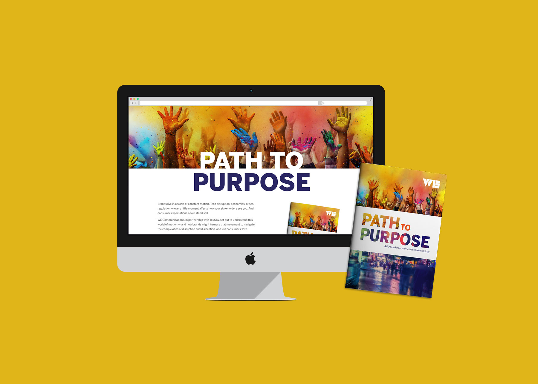
Bold branding for an independent agency
At WE Communications, people are at the heart of everything, rooted in the belief that communications are the catalyst for change. The brand was 5 years old when I was tasked with coming up with a refresh to carry us forward. I took their limited color palette of orange and green and introduced bold colors to create duotones, effectively expanding the color palette to visually represent our boldness and provided a way to transform stock photography.
Along with refreshed branding guidelines, I also created new PowerPoint templates, branded whitepaper templates, and email signatures to use agency-wide.
The content


Credits
Copywriting: Scout Colmant, Ian Denning


